As more Rotarians turn to AI tools to draft newsletters, flyers, and presentations, a quiet problem has emerged.
AI often gets the Rotary logo wrong. Ask an AI image generator for "the Rotary International wheel," and you may get a gear with the wrong number of cogs, a mismatched shade of gold, or text that doesn't quite match our official Masterbrand. These tools generate images based on patterns, not brand guidelines — and Rotary's mark is distinctive enough that small errors are easy to miss until it's too late.
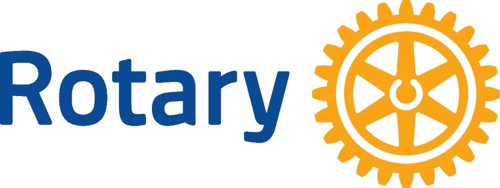
One quirk shows up again and again: AI doesn't like that the word "Rotary" sits off to the side of the wheel rather than centered beneath or around it. To an AI's eye, that layout looks unbalanced, so it "corrects" it — centering the wheel, resizing the text, or making the whole mark more symmetrical. The result often looks cleaner and more visually pleasing, but it's not our logo. AI is optimizing for aesthetics, not for brand accuracy, and it doesn't know the difference.
The fix isn't to avoid AI, but to be a better prompt-writer. Rather than asking an AI to invent our logo from scratch, provide it directly: upload the official Rotary District 5340 logo or Masterbrand file, and instruct the AI to use that exact image rather than recreating it. Most modern AI tools can incorporate a provided image faithfully, even if they can't generate one accurately on their own.
Bottom line: when AI is involved in anything bearing the Rotary wheel, don't let the AI decide what our brand looks like — you decide, and give it the real thing. A little care up front protects the integrity of our shared identity.